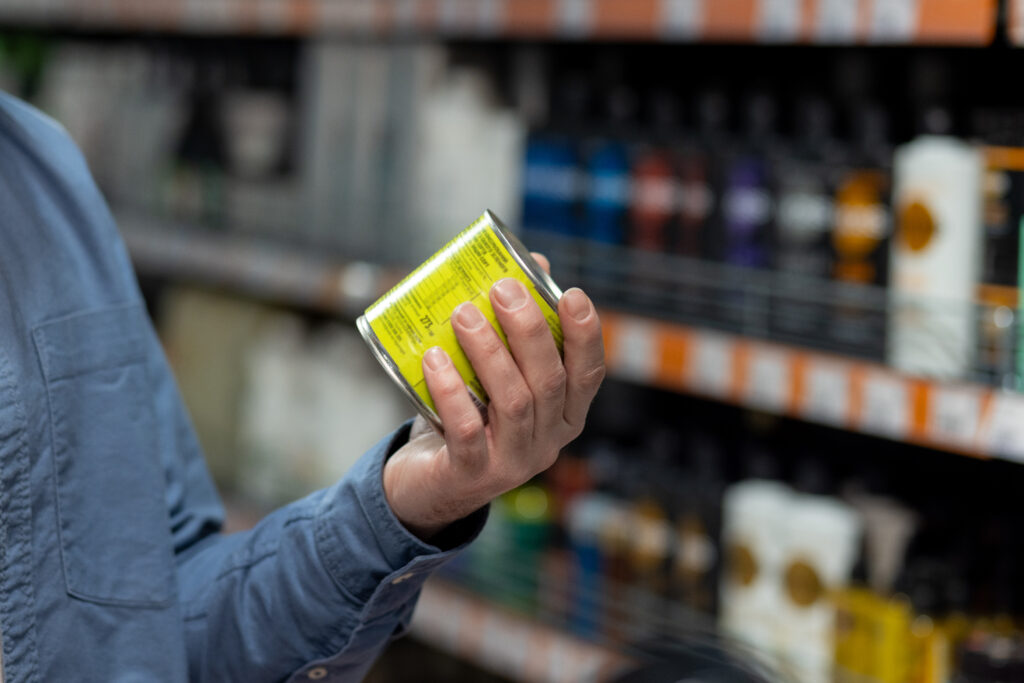
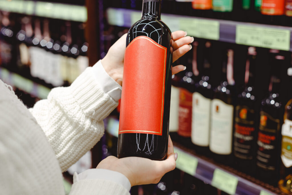
In today’s crowded retail environment, shelf appeal can make or break a product. Before a customer ever reads your ingredients, compares prices, or checks reviews, they make a split-second visual decision. That decision is heavily influenced by label design.
Strong label design does more than make a product look attractive. It communicates brand identity, builds trust, and influences purchasing behavior in seconds. Whether your product is on a grocery shelf, in a refrigerated case, or on an online product listing, your label design plays a critical role in how your product is perceived.
This guide breaks down practical, industry-proven label design tips for better shelf appeal so your product stands out, sells faster, and builds stronger brand recognition.
Why Label Design Matters for Shelf Appeal
Shelf appeal refers to how visually attractive and noticeable a product is in a competitive retail space. With hundreds of competing products on the same shelf, customers rarely have time to analyze details—they react visually first.
Effective label design influences:
- First impressions of product quality
- Brand recognition and recall
- Perceived value and pricing justification
- Emotional connection with the buyer
- Purchase decisions within seconds
Even a high-quality product can be overlooked if the label design fails to stand out or communicate clearly.
1. Prioritize Visual Hierarchy in Your Label Design
One of the most important principles in label design is visual hierarchy—guiding the customer’s eye through the most important information first.
A strong hierarchy typically includes:
- Brand name (primary focus)
- Product name or variant
- Key benefit or differentiator
- Supporting details (ingredients, features, claims)
If everything on the label competes for attention, nothing stands out. Good label design creates a clear path for the eye to follow.
2. Use Color Strategically to Influence Buying Decisions
Color is one of the most powerful tools in label design. It influences emotion, perception, and brand recognition.
Examples of color psychology in packaging:
- Blue: trust, cleanliness, professionalism
- Green: natural, organic, eco-friendly
- Red: urgency, excitement, boldness
- Black: luxury, premium quality
- White: simplicity, purity
Strong shelf appeal often comes from using colors that contrast competitors while still aligning with brand identity. A well-chosen color palette ensures your product is immediately recognizable.
3. Choose Typography That Enhances Readability
Typography plays a major role in effective label design. A beautiful label is useless if customers can’t quickly read it.
Best practices include:
- Use clean, legible fonts
- Avoid overly decorative typefaces for key information
- Ensure strong contrast between text and background
- Limit the number of font families used
- Maintain consistent spacing and alignment
Typography should support the message, not distract from it. In strong label design, clarity always comes before creativity.
4. Create Strong Brand Consistency Across Products
Shelf appeal increases significantly when customers can easily identify your brand across multiple products.
Consistency in label design includes:
- Color palette
- Typography system
- Layout structure
- Logo placement
- Visual style or patterns
When consumers recognize your brand quickly, trust builds faster—and trust directly increases sales. Consistent label design also strengthens long-term brand recall.
5. Use White Space to Improve Focus and Clarity
Many brands make the mistake of overcrowding their labels. However, white space (or negative space) is essential for effective label design.
White space helps:
- Improve readability
- Highlight key product information
- Reduce visual clutter
- Create a premium, modern feel
Minimalist label design often performs better on shelves because it feels more intentional and easier to process visually.
6. Match Label Design to Your Target Audience
Shelf appeal is not universal—it depends heavily on your target customer.
For example:
- Premium consumers respond to minimal, elegant label design
- Health-conscious buyers prefer clean, natural aesthetics
- Industrial buyers prioritize clarity and technical information
- Younger audiences may respond to bold, modern, or playful designs
Understanding your audience ensures your label design speaks directly to their expectations and preferences.
7. Highlight Key Selling Points Clearly
Your label should communicate the product’s most important benefits immediately.
Effective label design often includes:
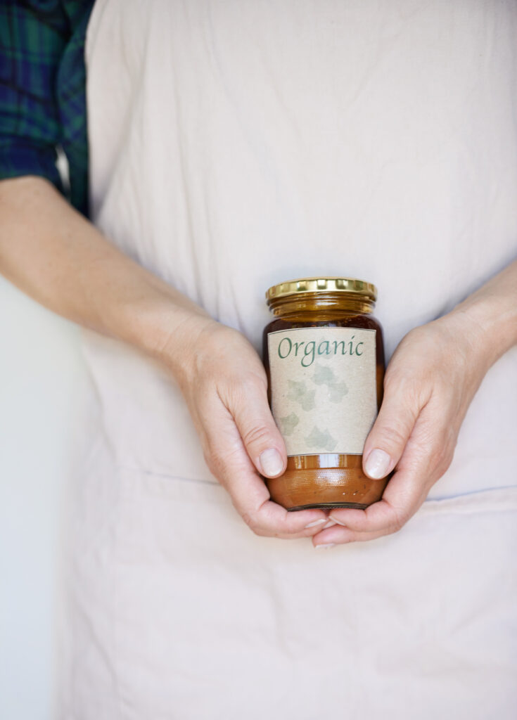
- “Organic” or “All Natural” claims
- “Sugar-Free” or “High Protein” highlights
- “Made in USA” or sourcing information
- Functional benefits (energy, hydration, durability, etc.)
These elements should be visually emphasized without overwhelming the overall design.
8. Design for Real-World Shelf Conditions
A label does not exist in isolation—it competes in real retail environments.
Your label design must account for:
- Lighting conditions (bright, dim, fluorescent)
- Distance viewing (across a shelf aisle)
- Product stacking and grouping
- Refrigerated or freezer condensation
- Handling wear and tear
Shelf appeal depends not only on how a label looks in design software but how it performs in real-world conditions.
9. Choose the Right Label Material to Support Design
Even the best label design can fail if paired with the wrong material.
Material affects:
- Color vibrancy
- Texture and feel
- Durability and moisture resistance
- Overall perceived quality
For example, a premium cosmetic product may benefit from soft-touch film, while a refrigerated beverage requires moisture-resistant materials to maintain shelf appeal over time.
Strong label design always works hand-in-hand with material selection.
10. Keep Scalability in Mind for Product Lines
If you plan to expand your product line, your label design should be scalable.
This means:
- Designing templates that allow variation
- Maintaining consistent structure across SKUs
- Adapting color or accent elements for differentiation
- Ensuring new products still feel part of the same brand family
Scalable label design saves time, reduces cost, and strengthens brand identity across product expansions.
Common Label Design Mistakes That Hurt Shelf Appeal
Even strong brands can weaken their shelf presence through avoidable mistakes:
- Overcrowded layouts
- Poor font readability
- Inconsistent branding across products
- Weak color contrast
- Ignoring competitor shelf positioning
- Using low-resolution graphics or images
Avoiding these mistakes can dramatically improve the effectiveness of your label design.
How Professional Label Design Impacts Sales
Professional label design does more than improve aesthetics—it directly impacts revenue.
Strong shelf appeal leads to:
- Higher product visibility
- Increased impulse purchases
- Stronger brand recognition
- Better perceived product value
- Improved customer loyalty
In competitive retail environments, small improvements in label design can result in significant sales growth.
Conclusion: Elevate Your Brand With Strategic Label Design
Effective label design is one of the most powerful tools for improving shelf appeal and increasing product sales. From color psychology and typography to layout structure and material selection, every detail influences how customers perceive your product.
Strong label design helps your product stand out in crowded retail environments, communicate value instantly, and build long-term brand recognition. When done well, it directly contributes to higher visibility, stronger trust, and increased sales.
If your business is ready to improve packaging, enhance shelf appeal, or get professional label design and printing support, contact us here.